


Why polished interfaces quietly change how much we question what we see.
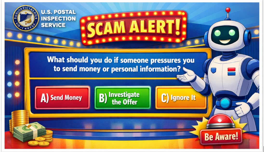
This showed up in my email inbox recently. A scam warning that looked like a game show, from the U.S. Postal Inspection Service.
Pretty cool, huh?! Bright colors. A robot host cheering you on. A big multiple-choice question in the middle of the screen asking what to do when pressured to send money or personal information:
A) Send money
B) Investigate the offer
C) Ignore it
It was really kind of brilliant. Clear, visual, and way more engaging than the usual wall of warning text we all routinely ignore. Click. Delete.
But what caught my attention wasn’t the advice. It was the presentation.
Logos. Clean design. Confident instructions.
The whole image signals authority. It looks official, polished, trustworthy; and exactly what you expect from a federal agency warning people about scams.
Very interesting, because those are the exact same signals that scammers use too!
Why That Matters
We have all learned a few basic rules about scams.
- Don’t send money to strangers.
- Be suspicious of pressure.
- Don’t share personal information with people you don’t know.
That’s all fine and dandy in theory.
But in practice, we rarely evaluate every message as thoroughly as possible. We rely on signals. Subtle cues tweak our subconscious into deciding if this is real or a scam.
Official logos help.
Professional design helps.
Structured information — buttons, choices, instructions — helps even more. Information presented confidently and cleanly is often categorized by our brains as legitimate. Without us even thinking about it. That subconscious at work.
And that shortcut is usually useful. We can’t dig into every email we get, check the header and track through all “that” – whatever “that” is that the sysad person looks at when you send them spam. We can’t scrutinize every website or message we encounter during a normal day to that degree.
This also tells us something important about modern systems – and about ourselves.
Presentation doesn’t just communicate information.
Presentation communicates credibility.
Let’s digress a bit . . . think about buying a car.
With a small roadside lot, we tend to be a little skeptical. That stereotypical image of a “shifty used car salesman” exists for a reason. We ask more questions. We double and triple check everything. This kind of setting tells us to pay close attention.
Now picture a classy dealership. Tall glass walls, bright lights, clean floors, professional branding. People in sharp clothing handing you brochures, bringing you coffee or drinks, while you walk around.
Both places are trying to sell you a car. And would be perfectly happy to take as much of your hard-earned money in the process as possible.
But the environment has changed something important.
Before a word is spoken, before we go through the door, or even get out of our vehicles, our level of skepticism is set.
Sometimes, the difference between misleading and trustworthy is less about content and all about the presentation.
The Shortcut Our Brains Take
This shouldn’t be surprising, once you think about how we interact with systems.
We don’t verify every individual piece of information. That would be impossible. We look at aggregates; we look for signals. These signals, these clues, help our brains decide quickly whether something is trustworthy.
Modern software is full of those signals, those clues.
Charts.
Dashboards.
Clean layouts.
Structured reports.
Official logos.
Confident language.
Every one of them tells our subconscious the same thing: someone competent built this.
And, most of the time, that assumption is valid. A professional-looking report? A professional team or process. A polished interface? A team that cared about their product.
Here’s the caveat . . . That shortcut has a side effect.
We start to treat that presentation as if it is evidence.
- A chart looks precise? Those numbers must be reliable.
- A system speaks clearly? The answer must be correct.
- The interface looks official? The message must be legitimate
The appearance, the structure, of the presentation
becomes a replacement for verification.
And this, this is the psychology behind why scammers imitate the visual language of trusted organizations. They copy logos, formatting, tones. They pretend to be a utility company, or other government entity. They know that if it looks official enough, many people will accept it at face value.
That same dynamic shows up in legitimate systems too.
A polished dashboard can make broken or unstable data pipelines look healthy.
A well-formatted report can hide questionable assumptions, make them feel solid.
A confident AI response is just a prediction, but can sound like true understanding.
These systems aren’t trying to deceive anyone. But they are doing something very powerful.
They send signals. Signals that influence how much scrutiny, and what kind of scrutiny, we apply to what we’re seeing.
To be blunt, the interface isn’t just delivering information, it’s telling us how much we should trust it.
Where This Shows Up at Work
Now that you’ve noticed this pattern, you will see it everywhere.
A dashboard on the screen during a meeting. Clean colors, smooth charts. Neatly labeled metrics, nice trends. Boss glances at it, says “looks good,” and the team moves on.
But did anyone in the room verify the pipeline feeding that data? When was the last time it updated? Last week? Last month? Three months ago?
The presentation did the work. It looked organized, professional. So our brains categorized it as reliable.
That shortcut is normal, understandable. None of us have the time to audit every system we touch.
But it carries a subtle risk.
When presentation becomes evidence, scrutiny quietly disappears.
The USPS clearly understands this. Their “game show” warning works because it uses the same visual signals we already associate with trustworthy systems. Logos, structure, clear choices. All in a format people instinctively recognize as valid.
Scammers come at the same principle from the other direction.
No longer do we get weird random messages, with typos, grammar mistakes and odd words. Now they copy the visual language of government agencies, banks, even delivery companies. Professional layout, official tone. Buttons exactly like the ones on the official sites.
Because they, too, know how we judge information.
We don’t just evaluate the message.
We evaluate the presentation of the message. We look for that little sprig of parsley; the curlicue of sauce that signals something is “done right.”
And when the presentation is right, the content frequently gets a free pass.
The Part That Still Belongs to Us
Don’t get me wrong – this doesn’t mean clean interfaces are bad! Quite the opposite!
Good design is useful. It promotes systems that are easier to understand and use.
But it can also create a sense of false sense of certainty.
- A chart can show numbers clearly without proving those numbers are correct.
- A dashboard can summarize a system without validating the system behind it.
- A polished answer can sound confident without actually being right.
Because: Visibility isn’t verification.
It’s on us to remember that interfaces show us results; they don’t prove those results are valid.
Systems don’t just provide information.
They quietly shape how much we question that information.
That responsibility doesn’t go away just because the interface looks convincing. If anything, it increases the responsibility. The more polished a system looks, the easier it is to stop asking questions.
Here’s the kicker: Sometimes the most convincing systems are the ones that deserve the most scrutiny.

Protovate pioneers new software, new systems, and new ways of working to bring your concept to life. Our hybrid-shore software development outsourcing model gives you access to the ideal talent to make it happen.