


Accessibility? I’m fine, I don’t need that stuff. No wheelchairs, no handicapped placards. Accessibility isn’t really relevant to us. Let’s rethink that.
In my family:
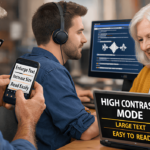
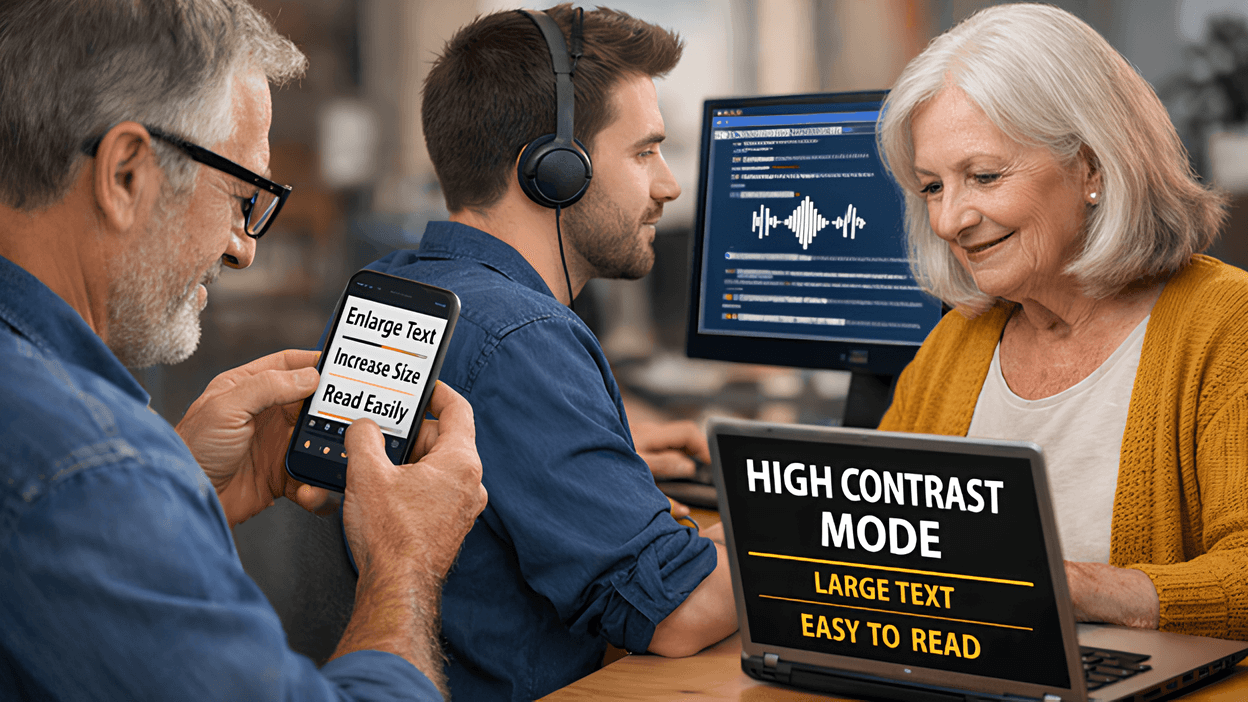
We use a reader. We use high-contrast display settings and reversed text (black screen, white letters). We use enlarged text. We deal with color-visibility issues. We avoid flashing or strobing screens. We just don’t always call those things “accessibility.”
Many of us rely on accessibility features without thinking about it, or without even knowing it. They’re built into our phones, operating systems, and browsers, quietly helping us read, navigate, and work. And if we’re doing that, without even realizing it, imagine the people that depend on them, just to get through their daily lives.
What if using a reader wasn’t a nice-to-have, but required?
What if increasing the text size was the only way you could read a page — and enlarging it pushed half the words off the screen so you had to scroll sideways to finish a sentence? And then had to scroll down to get to the next line?
What if you couldn’t use a mouse or touchpad?
You tab through a dashboard using only the keyboard. That’s fine and dandy when the focus moves in order. But what happens when it jumps somewhere offscreen? When you can’t find where you are anymore? We’ve all had that happen to us – and generally speaking, clicking a few times will return the cursor to where you can see it again. But what if you can’t SEE it?
These aren’t rare edge cases. They’re accessibility problems — and they happen more often than we realize.
A Design Test, Not a Feature
Accessibility isn’t a special accommodation. It’s a design quality test. It isn’t about just a few users. It’s about whether the interface is understandable at all; about whether the design works in the first place. If increasing the text size breaks a layout, the layout was fragile. If keyboard navigation fails, the interface depended on precision instead of clarity. If color is required to convey meaning, the information wasn’t communicated.
Accessibility doesn’t just help people with disabilities; it exposes design assumptions and weaknesses. And improving accessibility improves the overall quality of a website. The same issues that block a screen reader will also block someone using a phone in the sun, someone with a broken mouse, someone relying on voice control, someone aging, or someone simply tired, distracted or rushed.
Your Future Self
Sometime, somewhere, each of us will experience limitations.
An injury. Aging eyes. A migraine. Bright sunlight on a screen. A broken mouse. A noisy room where video can’t be heard, or a quiet room where it can’t be played. Fatigue after a long day.
Accessibility stops being theoretical and becomes reality in those moments. It is the difference between being able to use something and being locked out.
You may not need accessibility every day.
But eventually, everyone does.
The goal of accessible design isn’t to make a website usable for a few more people. It’s to make sure it actually works, for anyone, in real conditions, on real days, not just ideal ones.
When we design with accessibility in mind, we aren’t building for others – we are building for our future selves.
Protovate pioneers new software, new systems, and new ways of working to bring your concept to life. Our hybrid-shore software development outsourcing model gives you access to the ideal talent to make it happen.