


Why interface changes have an adoption cost, and why good design accounts for it
So you open Excel or Word or some other application you use every day, and click the button for the tool you use the most.
And the whole thing crashes around your ears.
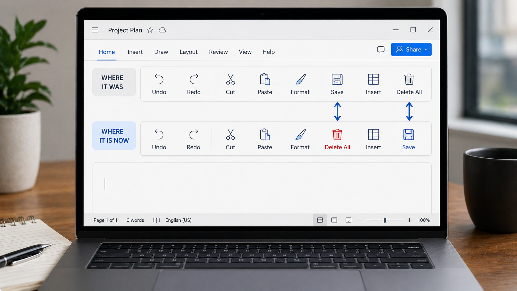
What happened? Some spiffy overnight “upgrade” moved your favorite button, and now your well-trained hand just clicked “Delete All” instead of “Save.”
That sounds ridiculous until it happens to you.
Then suddenly a “small interface improvement” has turned a routine task into a preventable mess.
Because when software breaks muscle memory, it doesn’t just move things around. It turns reflex into friction.
That’s the part that often gets overlooked.
Once a task becomes familiar, people stop actively navigating the interface. They’re not hunting for buttons anymore. They’re working from habit, rhythm, and muscle memory.
Move one button, rename one command, or “simplify” one toolbar, and a task that used to take two seconds suddenly needs your full attention again.
That hidden cost rarely shows up in the release notes.
Teams naturally measure the visible parts of a change: launch success, feature usage, adoption, maybe engagement. What’s harder to measure is the retraining cost – the hesitation, the reorientation, the extra clicks, and the preventable mistakes that happen when familiar workflows suddenly change.
So an update can look successful on paper while still making everyday work harder for the people using it.
Not every change is bad. Sometimes redesign is necessary.
But if you’re going to break learned behavior, it should solve a real problem, not just create a different layout.
And the impact goes beyond simple annoyance.
When familiar workflows keep shifting, users slow down. They hesitate. They make more mistakes. They spend more time reorienting instead of working.
That doesn’t mean change is bad. It means interface changes carry a real adoption cost, and good design treats that cost as part of the decision.
Good teams don’t avoid change. They make it intentional.
If a familiar workflow has to move, the gain should be meaningful, the new path should be obvious, and the disruption should be minimized wherever possible.
Sometimes the best design choice isn’t the cleverer interface. It’s preserving what users already know so the software stays out of their way.
That’s easy to forget in a culture that treats constant change as proof of progress. But stability is a feature too. Familiarity is part of usability. And when people stop thinking about the interface, that isn’t stagnation. That’s success. Sometimes the best software isn’t the one that changes the most. It’s the one that makes the work easier, faster, and less distracting, so the software stays out of the user’s way.
Jana Diamond
Jana Diamond, PMP, is a Technical Project Manager at Protovate with a career spanning software development and Department of Defense programs. She’s known for bridging technical detail with practical execution—and for asking the questions that keep projects honest. When she’s not working, she’s likely reading science fiction or hunting down her next salt and pepper shaker set.